Project is finally about 99% done. All that is left is some minor editing!
It's been a really tiring journey but it has been a wonderful and enjoyable experience for me. I'm really lucky to get two great teammates for this final project. Hahahaha. We had lots of fun talking cock. Despite that, we accomplished our "seemingly too ambitious" project albeit not perfection. There are definitely things that we can improve on. Our artwork. Storyline. Grammar. Programming. Effects. I'm pretty sure if we were given more time to work on these, we might just be closer to perfection.
Sunday, 17 November 2013
Sunday, 13 October 2013
Class exercise
Basically, we tried doing up a webpage for us to place our drawings. It was relatively easy, thanks to dreamweaver's newly added function. However there were still problems like alignment etc.
We also tried using "anchor link" for our final project. It was confusing at the start but I sort of got it at the end. Looking forward to final project :)
We also tried using "anchor link" for our final project. It was confusing at the start but I sort of got it at the end. Looking forward to final project :)
A3 Critique
I was the last for critique this time round. I personally felt that it was really cheesy. So this time round i will make it into a more dramatic comic! Look forward to it :)

Overall comments:
Cut the last part with the umbrella thingy -> Less cheesy and ambiguity?
End at the pouring down scene -> dramatic, ambiguity?
Confusing -> i will try to simplify
Flow: Okay
Panels lineup: Reasonable

Overall comments:
Cut the last part with the umbrella thingy -> Less cheesy and ambiguity?
End at the pouring down scene -> dramatic, ambiguity?
Confusing -> i will try to simplify
Flow: Okay
Panels lineup: Reasonable
Friday, 27 September 2013
Thought processes and considerations for Assignment 2
I took a leap of faith, jumping into a comic which I have not showed the class for critique. instead of all the long comics that the class have drawn, I decided to draw a series of short comics instead.
So, I took awhile, thought about the contemporary issues that is happening in Singapore. All the stuffs about flash floods, fogs, hot weather, overpopulation, I came out with my own response to these problems. I don't think "deep" comics are my style of drawing, I prefer these short and sweet, slapstick comics. Since, I am no deep thinker by all means.
The comic style I am heading towards is slapstick comedy, with slight injection of irony, which I used to provoke thoughts among readers. These exaggerated actions, thoughts, behaviors and activities exceeds the boundaries of common sense. For example, swimming or surfboarding in the flood, or peeping using the fog as disguise, that is just unthinkable. However, my point is that, I emphasize, injecting a humor into our daily problems, hoping that people will just joke about the problems we all faces, NOT forgeting the problems, but just looking past the problems so we won't feel sad all the time.
I used a lot of Singlish in the comic as I think that it is what makes a reader familiar with the comic. Since the context is Singapore, how can a comic without a slight injection of Singlish be a comic about Singapore? It is, I guess not very suitable for global scenes but it also raises the question of whether Singlish is indeed, a form of Singapore identity.
I used HDBs in all the second panels because I feel that HDBs are one of the Singaporean identity, which makes us stand out from other countries. All these blocks houses more than 70% of the Singaporean population. It is also the group who will be affected most by whatever problems which Singapore faces, be it, over population, economy crisis, job unemployment, income inequality etc. They are in fact, probably the most unhappy group in Singapore. (assuming the riches aren't really sad about being rich)
A2

A proper breakdown of my comic:
Title: I prefer looking at things from the other perspective. Especially when life gives you shit, you just got to see how great that piece of shit is. That is the reason why I drew this comic. I named this comics, Looking at the bright side of Singapore. That is to say I admit, yes, we have all the problems, but there is definitely something good about these problems that we have failed to see.
So loving it: Addressing the issue of flash floods. Irony injected through phrases like, "floods rock" "no wonder the government does nothing to fix it" "hope it floods everyday". It is simple to understand because, we don't want it to flood every single day, in fact, don't flood at all please. But I guess it is an unique experience for people who haven't seen a flood before, cause you kind of can do a lot of fun stuffs. For example surfboarding (exaggerated), but you can actually swim or splash water at friends or even fold paper boats and let it float on the water. I guess Singaporean kids nowadays have lost their childhood and care more about their ipads and phones etc. Oh, and probably because of all these devices, we can't even surprise a person by pouring water at him. (yeah, because the phone will get wet and spoil)
Benefits for everybody: Addressing the issues of fog. Slapstick humor with a bit of sexual and idiocy in the comic. Modified the characters in 1,3 & 4 panel with masks. They actually think they can hide themselves in the fog and enter the female toilet without being able to see yet be able to see naked girls. That is dumb hahahaha. Why I named it benefits for everybody: because isn't it great to be able to hide your presence?
The hotter, the better: Addressing singaporeans always complain about the hot weather. Slapstick humor with a bit of sexuality and idiocy. Girls are challenging the limits everyday, wearing shorter and shorter skirts or shorts as each day passes. I am no moral police but sometimes, isn't it better to not expose so much skin. I drew this to raise awareness that "GIRLS, GUYS ARE WATCHING WHAT YOU WEAR.", unless you really want to show, then so be it. One can look hot without exposing.
Heart-warming Singapore: Addressing overpopulation and foreign "imports", Irony injected in "Heart-Warming" and cosier place. The word play was intended, with more people, we will feel more warmth (body warmth since we are living in such close proximity).
End: I did want to address the issue of happiness in Singapore, like my failed comic attempt at the critique session. Why did I say its complicated? Because you can see, there is no clear cut answer to that question. Life isn't as simple as - you give me an apple and I'm happy. Instead it goes like - you give me an apple but stole my pear and grapes, so am I happy? It is complicated. But the answer is within how one sees the world. The blue character suffers from a dilemma because on one hand, living in Singapore has its perks and on the other, it has its woes. SO i named my comic, looking on the bright side of Singapore.
A2 Critique session
 One of the main critique that I got from the session was that the issue I wanted to address, I wasn't able to fully answer it properly. Singaporean's unhappiness can come from anywhere and it is subjective thus it is very complicated. I thought very hard, and tried very hard to figure out what exactly does it mean to be happy for me, and for other Singaporeans, but I realized it is quite extreme to portray it in a short comic.
Ms Chiang suggested that I show a broader sense of knowledge by drawing how Singaporeans want more and more and is never satisfied, and how, even when they reached the paramount of "success", what is next? The issue of being happy touches on too many difficult issues which I myself, isn't clear of what it means to be happy. I originally thought happiness is to be able to find someone we care for but it isn't so simple. There is so many factors and life is so difficult, finding our true love is not necessarily going to make us happy. That perhaps, explain the high divorce rate. Perhaps the comic will be more suited if the main character was an old grandpa, who lived most of his life, went through thick and thin with his spouse, I think that would make a more convincing comic. However, one of the main takeaway from the critique session which I felt was most important is, I am not suited to draw such deep topics. I guess I lost myself while trying to impress people with my "knowledge". My field isn't at drawing such deep comics (inspired by Some people), I guess I should stick with slapstick humor, which I'm more comfortable with.
Thus I started to redraw the entire comic.
Sunday, 8 September 2013
Comic Review

This is one of Watchmen's more prominent scene
whereby Rorschach AKA Walter Joseph Kovacs was framed and got
caught by the policemen. The writer Alan Moore and artist Dave Gibbons used
various panel transitions for this page, mostly subject to subject, action to
action and aspect to aspect (not really sure whether there is).
From the third last panel to the second last
panel, the gutter allowed closure. Just by seeing the two panels, one can tell
that he has been removed from the scene but, how did he get out of the place,
did the police drag or carry him, it is all up to our imagination.
2 different types of speech bubbles were used. One cloudy and one normal
bubble. It seems as if the cloudy bubble is used to indicate his altered voice
while he is in disguise. And when he is unmasked, his "voice"
returned back to normal thus the normal speech bubble. Sounds like kaaaah and
aaaanh were also used in speech bubbles to bring more effect to the comic.
Showing more emotions and life in the character.
A few types of image text interaction are also identified. For example,
Picture specific:4th panel (uuk)
Duo:2nd panel (kaaah)
Additive: 3rd, 3rd last panel (everything balances)
Friday, 6 September 2013
Class exercise 4
.bmp)
It goes like
"I'm cold."
"It's cold."
"He's cold."
"Still cold."
"The ice-cream better be cold too."
Wednesday, 28 August 2013
Assignment 1

This is my draft for Assignment 1. I had some initial ideas about the submission but I decided to not do it because we are not able to freely change the dimension aspects. So i brainstormed awhile to come out with this concept. The decision to use minion was simple, because it is popular and cute. Thus I am appealing to you all with cuteness this time. Storyline isn't impressive at all, it is a simple love triangle with one getting the girl and one not getting the girl. To actually beef up the story, I wanted to let one of the guy minion present MONEY instead of his LOVE and have the female choose it... but I guess that is a bit critical so I decided not to do so.
The reason I used black background for the last panel was to show the feeling of dejection... Not sure if that is the right choice.
Technical details...
I used 3 minions for this project. Their hair and costumes are all pieces of my old clothes. I went ahead and cut them into pieces and tried to make my minions distinguishable. Initially when I took the photo, I made a desperate attempt to create a romantic background which i failed because I have not enough material.


As you can see... it looks horrible. So I did a little bit of photoshopping, removed the background, increase its brightness and saturation and added a few digital pin ons to make my comic feel livelier. (Since these minions have no facial expression)
SUPER LENGTHY POST! PAISEH!
Class Exercise 3
This lecture, we analysed Luke Pearson's Some People.


The long panels, I assume would serve to illustrate the loneliness that the man feels as he walks on the road. As if walking to infinity. And of course, to show the mother and child avoiding him.

This is a brilliant way of portraying the life course of this woman. One can clearly see the evolution process that the girl underwent, one of the attractiveness of comics is that we can see both the history, present and future, this panel allows an easier browsing through the girl's aging process. This is a good way to save space and time.


This is a fairly interesting comic which I had to read a few times to understand. Luke used a handful of techniques to help him narrate the story.
For example, his smart use of gradient to indicate a change in age. It is easy for the reader to identify that they are of the same person despite looking different in every panel. His use of colors also helped him illustrate the character's change in personality. Yellow being a "cooler" color than red indicates the subsequent change in personality.

Luke also uses a variety of elements like a black background which I assume that it indicates a panel whereby judgments are being made, be it being judged, or judging others. However, this is just an assumption because I am still unsure of what the black background would mean. I would really wish someone would give me a convincing explanation.
Luke used two types of text box to narrate his story. The cloudy text box indicates a thought while the solid box indicates a speech being made at the moment. This is a standard protocol in which most comic artistes adhere to and readers are accustomed to this way of interpreting.


This is a brilliant way of portraying the life course of this woman. One can clearly see the evolution process that the girl underwent, one of the attractiveness of comics is that we can see both the history, present and future, this panel allows an easier browsing through the girl's aging process. This is a good way to save space and time.

Friday, 23 August 2013
Class Exercise 2
1) Moment to Moment
2) Action to Action


2) Action to Action

3) Subject to Subject

4) Scene to Scene

5) Aspect to Aspect

6) Non Sequitur

Sunday, 18 August 2013
Class Exercise 1: What is sequential art?
For an art piece to be considered as a sequential art, it needs to have a few characteristics. There may be differing thoughts on what sequential art is but this is how I see sequential art.
These characteristics are
1) There needs to be a clear sequence which allows the reader derive meaning from reading it.
2) There is a focus group/target which enables the author to tell a story. (Something like main lead)
3) There needs to be substantial amount of art. (That is to say that there are more pictures than words)
4) The readers need to be able to see development in the art piece.

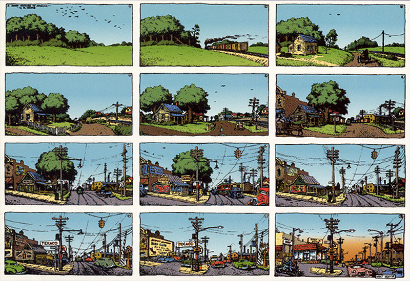
These are standard examples of sequential art where the frames tell a story, there is a clear sequence and there is a focus in the story. Most comics are like that.

While there may be a few clear cut examples of sequential art, most of the art pieces are very ambiguous. I would consider this to be a sequential art because I am able to tell what the sequence is, who is the main focus and there is some sort of development through the "frames".

While there is a clear sequence. the graphics seem to play a secondary role in storytelling. I wouldn't consider this to be a sequential art.

This posed a larger problem for me as I can't tell what is exactly is this. As much as I tried to force a story out of it, I failed miserably. So I would not consider this to be a sequential art.
Subscribe to:
Comments (Atom)